Maple 12 Interface

One of the reasons we've decided to jump into this CAS process at this point in time is that the new interface is far more student-friendly. We were loath to start with a CAS when the learning curve would be so great. While I know that some would say that the TI is a possibility, it's short-sighted; no one uses the TI software/handhelds beyond highschool. And the hand-helds are a button-intensive, small screen mess. It's a toss-up between Maple and Mathematica - and we have an existing relationship with Maple (it's HQ is down the road an hour).
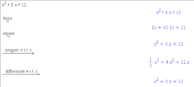
The interface is now far more point & click with no (okay, few) arcane (to students) commands and it describes the step that has been performs.
Graphing is a lot easier (you can drag an expression onto a grid and it graphs!) and parameters can be automated with a click.
That, of course, is the easy part done. Now, the hard part:
  • what questions do we ask to develop understanding, concepts, algorithms?
  • how do we encourage exploration over presentation?
  • how do we avoid an emphasis on calculation/algorithm/button pushing? This can't be just "better worksheets through CAS"
  • how do we make the link between paper-pencil and CAS techniques?
  • how do we strength understanding of equivalence (since CAS' representations differ)?
  • how do we deal with the time factor? (student-centred takes more time)?
  • are our teachers ready to deal with the mathematical conversation that will/should occur?

Comments

Popular posts from this blog

Desmos, OneNote & Replay

So using Desmos activities are a great way to encourage exploration and discussion in math class -- if you haven't tried them, I encourage it.  They're collected at  https://teacher.desmos.com/  But ... Desmos doesn't give you quite enough.  It doesn't have a way of capturing the work that the student does within their space, and it doesn't allow for annotation of class contributions as we come together to discuss.  Well, not surprisingly, OneNote comes to the rescue.  Using the Windows shortcut Windows-Shift-S it is really quick to snag the Desmos screen and pop it into a waiting OneNote page.  From there, we can grab our pen and (using wireless projection) talk about what all the different responses mean and where to go from there. (An aside : one of the nice features of Desmos activities are the way you can hit PAUSE and it will pause all the screens of the students working.  I always give them a heads up "10 seconds to pause..." and it's refr

So you want to hack your OneNote Class Notebook

Taking a brief break from my "Getting Started with OneNote Class Notebook" series (you can start that one here )... This is a little advanced so if you're not comfortable setting permissions inside of Office365 you may want to avoid this.  Or set up a Class Notebook to play with so that it doesn't affect any existing Class Notebooks.  Yeah, the latter is a good option. One of the great powers of OneNote is that you can do some really neat permissioning of the Section Tabs. When the Notebook is created, of course, it gives you an "open permissions" on the Collaboration Space and student-read-only on the Content Library.  And then each student space is wide open to each individual student. But we've found that occasionally you want to mix up the permissions a little.  For example, you could create a space in a student section for your private notes that the student couldn't see, or maybe you want a tab in the Collaboration Space that students cou

Making your own font

Slid in amongst all the announcements for Ignite, Microsoft's big conference in September, as a tool that I thought was quite cool.  Not original, since similar things have existed elsewhere & when, but a nice option nevertheless. Microsoft's Font Maker allows you to create your own font using digital ink.  You get all 26 characters, numbers and punctuation (for English languages) on which you draw your font for each character. (For me, it's the first 128 printable characters out of the ASCII table!)  Using your #digitalink pen, you draw out what you want each character to look like. I just quickly wrote out the alphabet as you can see below: You don't have to do it all at once and you can keep working on your Font as you go; it saves as a JSON Project File which means you can send these between collaborators. Once you have your font done, you can adjust the spacing between characters & words to make it look good (it uses a scene from Hamlet -- I'